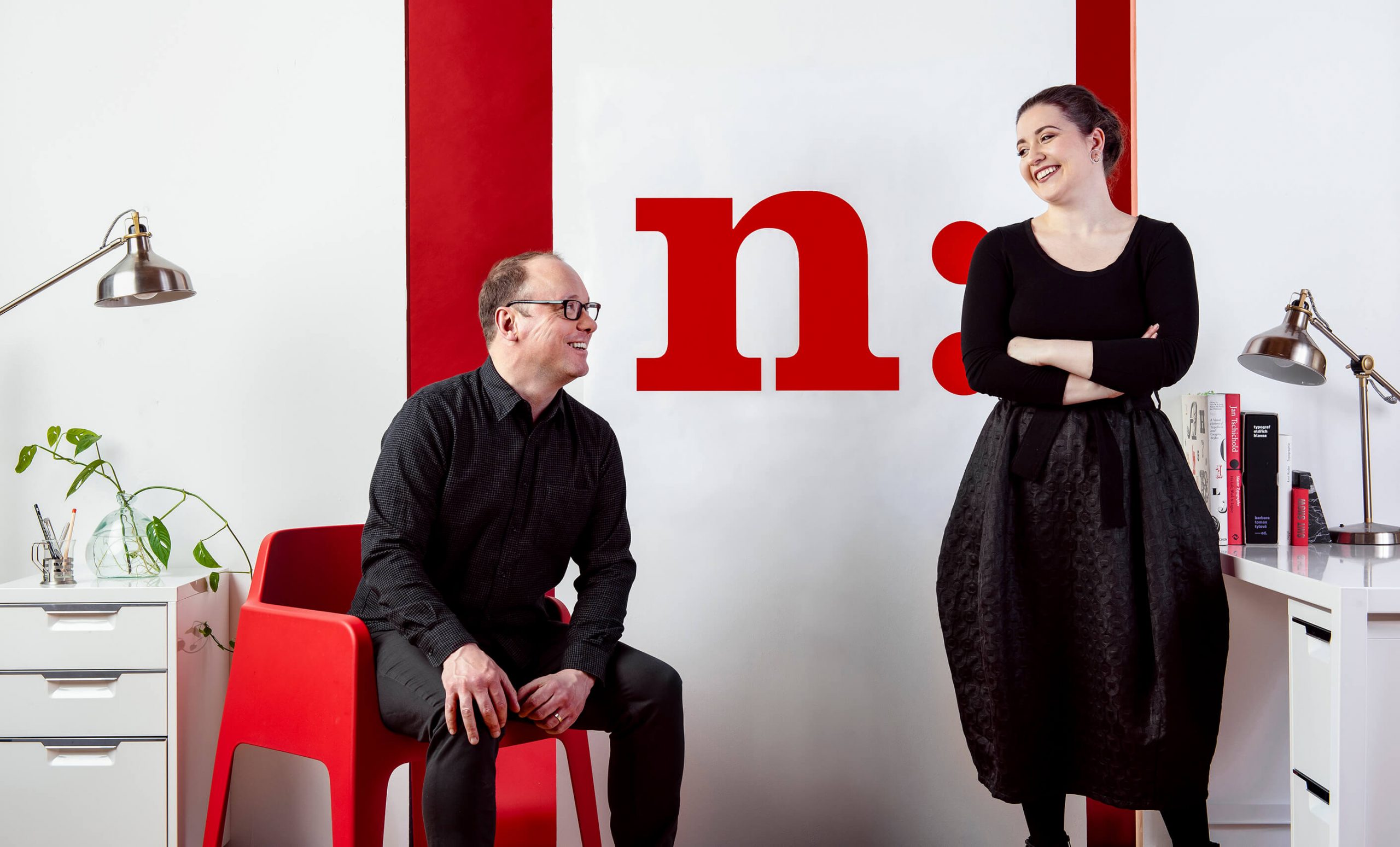
The graphic design duo and married couple, Sofya Karash and Daniel McManus of The Narrative bring us behind-the-scenes to discuss the new visual identity for the 900 910 N Lake Shore apartments. This is the first rebrand the buildings have undergone since the late 1970’s. As professors of graphic design and students of modernism, The Narrative approached this project with extensive archival research and interviews that became critical to the design of the visual identity. The final logo directly references the “golden ratio” of the black windows—perhaps the most visually iconic aspect of the buildings. In keeping with Mies the style is rational, methodical and stripped of subjectivity wherever possible. Of course, the art of designing the identity centered on elegantly incorporating the stories and vision of key stakeholders heavily invested in the enduring life of the buildings.
Ashley Lukasik: How did The Narrative get involved in this project originally?
Sofya Karash: We befriended Cynthia Weingarten, a resident, when we joined The Arts Club of Chicago. When the architecture committee put out the RFP with Trinita Logue heading it, Cynthia recommended us. I believe they narrowed it down to three design firms.
Daniel McManus: Initially when we received the email asking for our submission, we thought it was spam! There were so many numbers in the email address. We thought it couldn’t possibly be real, but we looked it up and realized that we were being asked to propose a rebrand for a Mies Van der Rohe building. So we submitted.
Our proposal centered around an understanding of what it’s like to be in a Mies Van der Rohe building. The details. The intelligence of the proportions. It was a research-based approach that may have been a little risky, but in retrospect it worked.
SK: I think they appreciated the intellectual approach. We’re both educators. The exciting part but also the challenge is that you’re burdened with the context and the history. You’re trying to create something that can move into the 21st century, but you can not have a standard design approach. The fact that we’re small and niche and can be very focused, that we both have Masters degrees in Graphic Design, and that we would do all of the design work ourselves, made us particularly well suited for this project.
What could be more Miesian than using two golden section rectangles to visually represent his masterpieces?
AL: Murmur Ring has also been hands on working on the editorial and photography. It’s extra personal for the residents of the building. What’s your experience been like working with the individuals in the building?
DM: We’re strict about being objective with what we’re doing, but we understand it can be emotional for a resident. Particularly with Mies, people have such strong opinions of him, his work, his legacy. At one point in 900 910’s history, there was decade-long debate regarding whether and which trees should be planted outside, for example. So we knew going into the project that every detail would be considered.
SK: Within our structured approach, the very first undertaking we felt was necessary before analysis was capturing personal stories. From our first meetings with Trinita and the other three members of the Architecture and Communication Committees, their dedication was clear. They’re in these buildings for a limited amount of time and feel a responsibility to carry them forward. For the committee, this is a passion project from the minutiae of signage in the garage to having large art interventions. We could sense how invested people were.
We spoke with the doorman who’s worked there for 30 years about the close relationship he has with the residents and what the space means to him. Everyone we spoke with gave us a different—but in some ways cohesive—perspective on the buildings. I think it emboldened us, and I got a lot of encouragement and joy listening to their stories.

Interviews with Brigitte Peterhans and Dirk Lohan and documenting the buildings
We tried to interview people who’d been there for a really long time, some more recent, some employees, to get a well rounded flavor of it. I remember from the very first meeting one of the people on the committee said “It’s the kind of place where everyone loves it and enjoys it, but when you get into an elevator with people we’re kind of very quiet and to ourselves and nobody says much to each other. There’s a kind of je ne sais quoi that’s almost Modernism translated into social interaction.”
AL: A lot of introverts! That’s so funny.
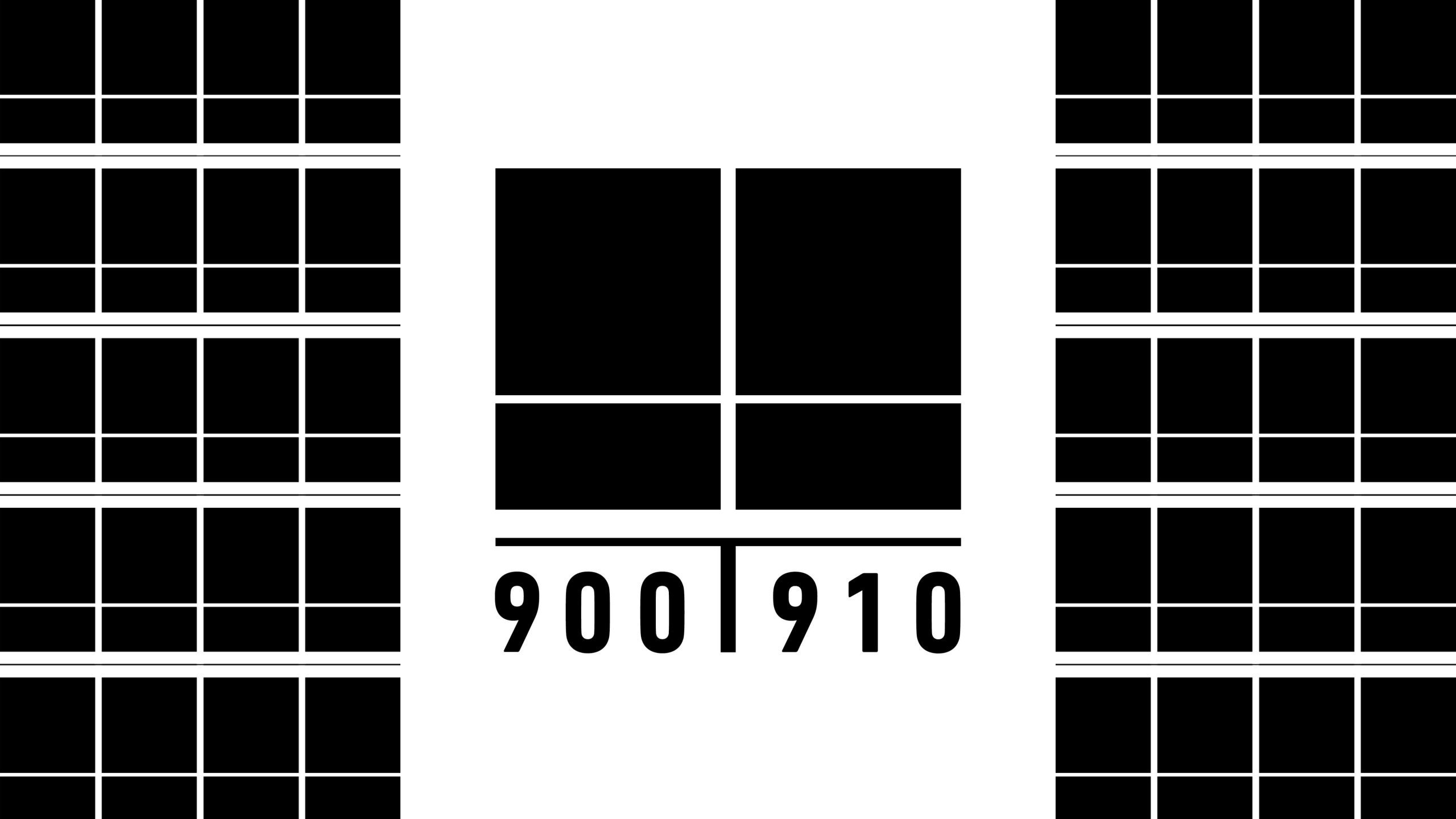
DM: The interviews led us directly to the final logo. When you look at the buildings the most obvious of the physical traits are the black windows. But it wasn’t really until we spoke with Margaret McCurry and she explained the golden ratio proportions of the windows, that we went back and revised the sketches. Because it formally was going to create a focal point. In our early sketches, the windows were integrated into the type/logo treatment. We were drawn to the simplistic yet visually dominating negative space intersecting in the middle of the mark.
We used the exact proportions of the windows for the final mark. What could be more Miesian than using two golden section rectangles to visually represent his masterpieces? Too many good things happening.
AL: This is a testament to your process.
DM: Sticking to the proportions was essential. Here are some of our first logo sketches. On the top left is a logo that ended up looking like Crown Hall, and we figured if they didn’t like it, we could adjust the proportions and sell it to 860 880 Lake Shore (laughs). We also started to isolate iconographic elements. Some are based on windows and some even reference Lake Shore Drive and are almost maplike.

Selection of early sketches for the 900 910 brand identity
The thing with this project was by digging into history the answers would reveal themselves. When you’re designing for a company that’s trying to stand out it’s about being different but appropriate. This is more like you have to stay within these rules but not have it be boring or expected.
We used this Mies quote as our guide for answers “Create form out of the nature of the task with the means of our time. This is our work.”
AL: Super referential. Talk about where you began, aesthetically.
DM: We bounced back and forth with a Mies typography idea. The second option that the client didn’t choose was all typographic. It was neither Bauhaus typography nor the type that Mies used.
Right off the bat our questions were “What is Mies typography?” and “What is a 900 910 North Lake Shore type treatment?” Loaded questions for designers, and particularly for us given that typography is a substantial part of our practice and our teaching. We used this Mies quote as our guide for answers: Create form out of the nature of the task with the means of our time. This is our work.
This typographic exploration led us to a fantastic journey in Brooklyn asking that exact question of Tobias Frere-Jones. This typeface was designed by Tobias Frere-Jones and it’s never been seen by anyone who hasn’t looked at our presentation. We met him in New York last summer for the Type Directors Club TDC65 Exhibition Opening and we started talking to him about the project. He was intrigued, and invited us to his studio in Park Slope.
Tobias and Nina Stössinger were incredibly generous with their time. We spent the afternoon discussing type and he showed us a typeface that he was currently working on as a personal project. The typeface with the appropriately named temporary title of “Provisorium”. A stunning, truly modern Modern Roman typeface with square geometric proportions. It feels elegant and industrial. It feels 900 910. It was so contemporary it wasn’t even finished yet, having only Caps and numbers available.
We believe that if Mies was to consider working with a modern typeface designer, it would be a world class typeface designer like Tobias.
Using “Provisorium”, we wanted the type treatment to reflect the position of the buildings in relation to each other. We had already created a number of sketches based off of the grid system of the buildings, and we experimented with using an ampersand and a line to represent the covered walkway connecting the buildings.

Sketches for 900 910 brand identity using “Provisorium”
SK: There’s a nice connection because there’s a bridge between 900 910.
DM: We literally argued that for a week.
Massimo Vignelli would say “Every single mark has to mean something.” This means something but then there’s this internal conflict between formally accurate and semantically accurate. Then Philip Burton who is a Professor and Founding Chair of the Graphic Design program at UIC, came over while we were working on it and said, “Everything’s great except for that line. It should be at an angle (like the 9).” I was like, “but it won’t mean anything,” and he said, “yea, but it’s gotta look right.” Ultimately Massimo won out, it had to mean something.
It seems silly that we spent a week on that but it was intense.
SK: There’s something really special about this type. It just has a feel.
The team agreed that this was a very strong brand identity option, and—in the Modernist tradition—spot on. But, was it Miesian? I think the chosen logo is more Miesian.
AL: Were they torn?
DM: Sure, but they chose what was most specific to this address.
Ultimately, we believed that a Miesian approach to typeface and forms should have rules. That’s where we started getting into the weeds of design theory and Modernism. It took all of my grad school education to keep up. We determined that the type treatment should have the following constraints:
a. Be formally related to 900 910.
b. Be either a German or a Contemporary typeface. The logic was that modern German typefaces could inherently have formal rational relationships to 900 910 and a Contemporary type treatment was in the Mies Modernist tradition of using the highest quality contemporary typeface offered to us by the means of our time.
c. It should not be Futura. When we looked at other websites for other Mies buildings we noticed they often used Helvetica or Futura. But Helvetica isn’t German and doesn’t really have anything to do with Mies. Futura is thought to be loosely connected to Bauhaus, but actually Futura and Mies were only peripherally connected to the Bauhaus.
We ended up choosing DIN Next for the typography. Knowing the history of DIN, we knew it had the rational design qualities that would be in line with Mies’s work. We had no idea how well it would work until we brought it together with the windows icon.

Final 900 910 brand identity
SK: There was a lot of consideration to what defines these buildings in contrast to other Mies buildings and of course the ones across the street. The main thing is that those are light and these are dark. So we felt this has to have weight, it has to be dark. Black. Not white or grey.
AL: Would you say that in this project you spent much more time with typography than other projects or was this typical for you?
DM: This is typical. We have a system we use where we have pages and pages of typography—typically 600 or so typefaces. On this project because of our research, we had some tighter restrictions and didn’t need to look at everything.
SK: Basically we kind of work separately, review everything, then come together. It’s a constant process of refinement, review and analysis and then narrowing down bit by bit as we go along. Starting with type, then thinking about could it be an icon? Could it be a symbol? Is it purely typographic? The one that was chosen is more icongraphic than the other purely typographic one.
The next part of the process is for us to create hundreds of variations based on the type studies individually. At certain points during the week we come together, review, and mark up. Dan will design something, and I’ll see something that’s really interesting that he hadn’t seen. So it’s a constant really close back and forth collaboration. Oftentimes we’ll switch and I want to refine or play with something he started or the other way around.
AL: What’s the best and worst part of being a married couple working together?
DM: Um… when one of us is pregnant (both laugh).
AL: In ten years, or twenty years, you’re going to be like when we were pregnant with our first child we were working on this Mies project! And COVID was happening. There’s a lot going on.
SK: I have to show you the Bauhaus inspired baby outfit my mother knit for her.
AL: No way!! This is so funny and cute. Your mom needs to sell these. People would definitely go for it.
SK: She’ll be born at Northwestern. We’ll put on her Bauhaus outfit, walk out the hospital door, go to the MCA, bring her to 900 910, and have lunch at the Arts Club. (laughs)
But getting back to the question about marriage—the best part is we’re both equally passionate about what we do and we collaborate so much. And I think if we weren’t working together, I don’t think we’d spend any time together.
My parents worked creatively together. They met in art school and continued a collaborative, working relationship. So for me, this was normal and expected. I would stay up until midnight painting theater sets or helping them with art projects. It’s kind of what I wanted in a marriage, but for Dan it was very unusual and not how he grew up.
The biggest challenge is not bringing the work home.
AL: Being able to have dinner and talk about other things and not be like “but that one typeface…” (all laugh)
It doesn’t take much looking around your workspace and the books you have to observe how passionate you are about Modernism.
What does it mean to you to do a rebrand for Mies van der Rohe building?!
DM: It’s a dream. My own design heroes, Paul Rand and Massimo Vignelli, both viewed Mies as the ultimate titan of design. For me, it was a challenge not to get spooked by that. You know that it’s going to get a lot of attention and you want it to get attention for the right reasons. So many of our colleagues live in Mies van der Rohe buildings in Chicago. I know they’re going to see this and I want them to be like “Wow, that’s really great.” instead of “Oh god…’”
In the moment, we’re so deeply entrenched it’s hard to describe fully what this project has meant to us… but I can say with confidence it’s been one of the most profound and rewarding creative experiences The Narrative has ever been a part of.
AL: At the end of the day, it’s not that big of a world of architects and designers, and much of the Chicago community lives on this block. It’s like one degree of separation, not six. So yes, everybody is going to see this.
SK: It comes with all the history and the weight. That can become overwhelming, but we’re so assured in our process that we’ve repeated and refined over time. There was room to make a contribution design-wise, not as an architect competing with Mies. It was so long since the last time these were rebranded or there was any design thought regarding any internal materials for the residents in the building, signage, or anything external. I knew the buildings were special but after our research it was clear that they were truly a hidden architectural gem.
I felt there was space and room for us to make a significant contribution to raise the design bar, externally and internally to measure up to the architecture.
AL: I feel that way too. Absolutely. If these buildings were in New York City, it would cost three million dollars to buy a unit. It’s so Chicago to be so modest about it, but that’s also where the opportunity lies. And it makes it so worthwhile, creatively, because you really want it to be good.
DM: The two best branded Mies buildings are Villa Tugendhat and Baracelona Pavilion so we looked to those inspirationally.
AL: And I like the Farnsworth House brand.
DM: It’s timeless and appropriate, exactly what a Mies brand should be. At SAIC we actually teach with the person who designed that, Robert Petrick. I believe he used Copperplate Gothic for the typeface, Mies’ typeface.
SK: I was shocked when I found out that’s what Mies used Copperplate because it’s the last typeface you would expect him to use.
DM: Dirk Lohan told us it was something he liked in Germany and brought over.
AL: When was the last rebrand?
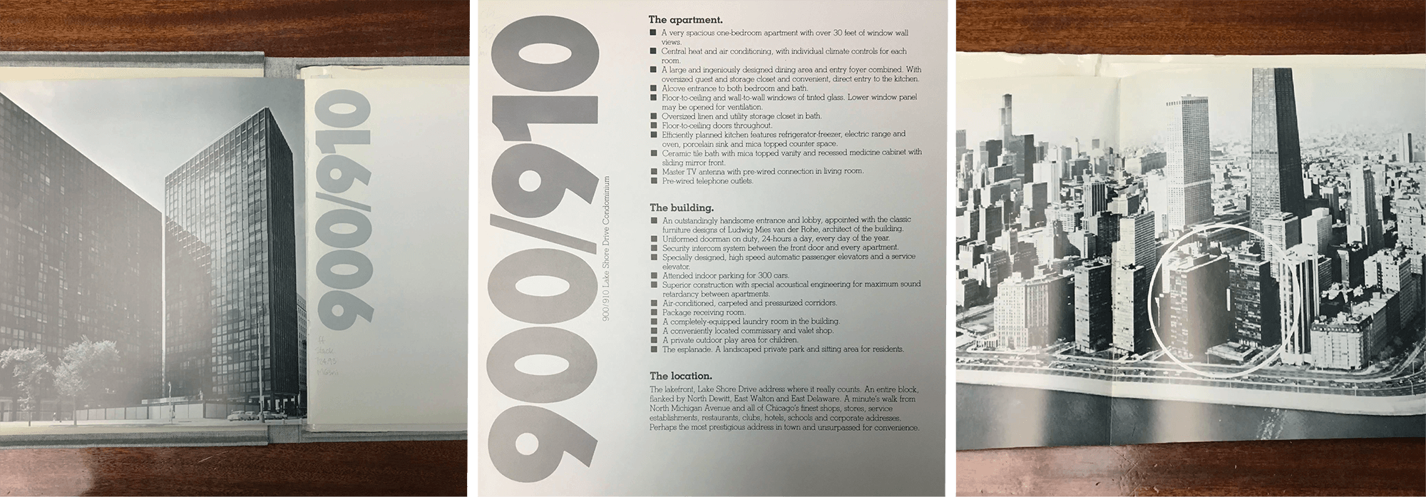
SK: In the late 70’s. This is from the last rebrand.

900 910 Promotional book designed by The Hoffman Advertising Group
DM: Being custodians of this brand, in thirty years when it’s time for a refresh we want designers to pick up our work and say “thank you,” instead of tossing it. We want to help set up a foundation for a future brand and help with the archive.
I think it was courageous for Trinita and the Board to have the vision for this, to be as thoughtful about it and open to letting the creative team do what we need to do.
AL: What’s the number one thing you learned or gained from this project?
DM: We’re still learning.
SK: That’s a hard question. I think flexibility. We’re working with a group of people who are equally passionate about the buildings. With Trinita, in particular, it’s more of a collaboration. Typically clients are decision makers. But with this project, it has grown organically. It’s like a fern or plant. We start with one piece, then someone talks to someone else in the buildings, and something new is revealed. It’s a labyrinth of things. We had a really good structure and process to begin with and we’ve had to learn to incorporate new things coming at unexpected times and in unexpected ways, through conversations, feedback and the unforeseen challenges introduced by the pandemic.
Typically it takes a good six months or a year to have perspective on a project. In the moment, we’re so deeply entrenched it’s hard to describe fully what this project has meant to us… but I can say with confidence it’s been one of the most profound and rewarding creative experiences The Narrative has ever been a part of.
AL: And I do think, it’s not just that the buildings are important. Of course the work is going to be really important to both of you because you’re in it every day. But I have the distinct feeling that this process was really important for everyone involved. A reason to stay engaged, particularly during this time.
DM: I think it was courageous for Trinita and the Board to have the vision for this, to be as thoughtful about it and open to letting the creative team do what we need to do.
SK: And to design an identity and not just a logo. They trusted us and were willing to take the time and energy to do it right. It’s not the glamorous things, it’s the behind the scenes things that lead to good design in the end. They felt the buildings deserved this. To build an identity properly starting from the foundation upwards.

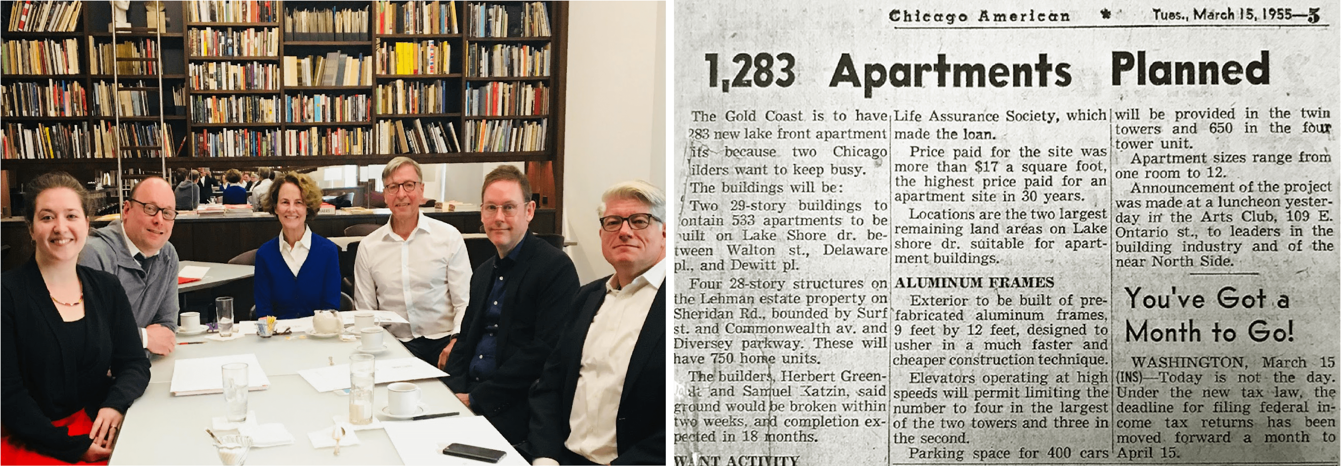
The planning of 900 910 was announced at The Arts Club of Chicago in 1955. The Narrative carried on the tradition by presenting the final brand identity options to the 900 910 Communications Committee in The Arts Club Drawing Room (left to right: Sofya Karash, Daniel McManus, Trinita Logue, Don Curtis, Timothy Kent, Dave Pickert).
We’ve designed a lot of the internal materials that are going to be used. We’re probably going to do new signage, interior and exterior. And brand standards so the brand lives on and can be implemented. Setting this up is a huge undertaking. This is why it’s taken over a year.
They all have creative backgrounds and appreciate good design and attention to detail.
AL: I wonder if it’s revealed for some of the residents how important the buildings actually are. Some are already very aware. Nick Weingarten speaks eloquently about that. I think Assaf’s installation achieved that—elevating 900 910. I’m so glad the architecture committee and everyone were able to be part of that last year.
This is critical, laying the foundation, but where it can go is really exciting.
DM: Throughout their entire history, the buildings have had a draw for influential people and architects. Even before they had influence or were making money, creatives were drawn and could afford to live there. That story needs to be told. All of these architects on the same block, and they all know each other.
SK: There is this monastic quality about how people live very intentionally there, and the things they give up. But they almost do that lovingly and willingly because it’s just bare bones good design.
AL: It’s a minimalist sort of thing. A Zen-like feeling.
SK: We were very much inspired at the beginning, because it was this theoretical concept. Now that we’re deep in the execution it’s really nice to have this conversation and just to mentally step back and think about how significant this is.
Our hope is for these buildings to finally be honored with a visual identity that reflects their significance within the sphere of Mies enthusiasts, architects, Chicagoans, and visitors.
AL: I felt this way about the The New Bauhaus film [that I produced]. We were sitting on this really important piece of Chicago design history, and people didn’t know! It’s made me acutely aware of looking around for the untold stories that deserve some light in our city, to capture the legacies. It’s interesting to get involved in this project—they are very different but share that in common.
SK: And that’s why it’s so much more than an identity. As the identity system gets implemented, we have begun to collaborate with Murmur Ring and everyone else who’s going to use and carry on the identity in all these different ways. Aesthetically but also functionally, all the components come together. You can’t be missing one piece for it to really live on, expand and inspire more creative work having to do with these buildings.
Ideally, it begins to cascade.

The Narrative is an award-winning, full-service, multidisciplinary visual communication studio in Chicago. They believe that designing well-thought-out work contributes positively to our culture as a whole. In a brand-cluttered world, The Narrative’s work is created with respect for its audience as a top priority. Both Sofya Karash and Daniel McManus teach in the Visual Communication Design department at the School of the Art Institute Chicago.

